It's no secret that Canada's greenhouse gas (GHG) emissions are much higher today than they were in 1990. By 2008, the latest year with data available, Canada's emissions were 24 per cent higher than in 1990. We're often told the fault lies with our growing economy and growing population. We do, after all, have a strong economy and one of the highest rates of population growth in the G8. Our emissions growth is certainly the highest in the G8.
But it turns out that the real story behind Canada's big jump in pollution is a little more complicated. The national numbers are masking some huge provincial variations.
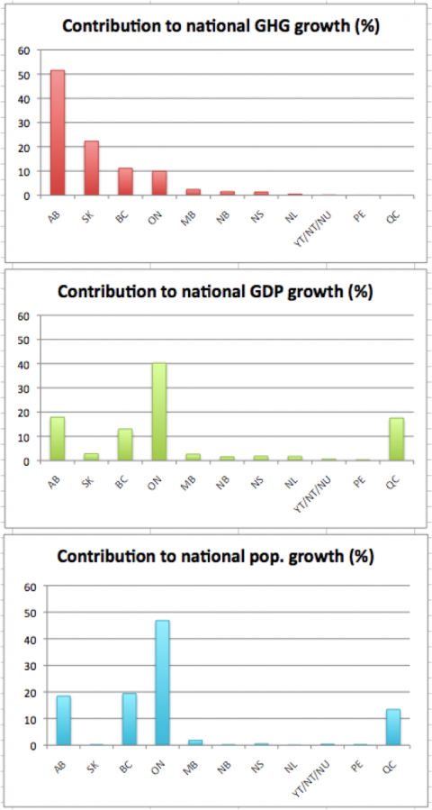
Environment Canada released new emissions data last month, and we've been digging into it. (You can too — by clicking here and scrolling to "Canada," then clicking "NIR".) By comparing provincial figures for 1990 and 2008 to the national totals, we calculated how much of Canada's total GHG growth each individual province is responsible for. We then did the same for GDP growth and population growth, and presented our findings in Figure 1.
The picture that emerges provides insight into the geography of Canada's GHG emissions, with some clear lessons for cleaning up our act.
Figure 1: Provincial contributions to national growth in greenhouse gas (GHG) emissions, population and gross domestic product (GDP) from 1990 to 2008.*

What jumps out right away is that Alberta is responsible for over half (52 per cent) of Canada's emissions growth since 1990, despite being responsible for only 18 per cent of GDP growth and 19 per cent of the growth in population. Combined with Saskatchewan, the two provinces account for an astonishing 74 per cent of national GHG growth, but only 20 per cent of Canada's GDP growth and 19 per cent of population growth.
Québec, on the other hand, which contributed virtually the same portion of Canada's GDP growth as Alberta (18 per cent) actually saw its absolute emissions fall, albeit very slightly. (In other words, Québec grew its economy while reducing its emissions, cutting national emissions growth by one per cent.) As expected, given its size, Ontario loomed largest in Canada's population and GDP growth (47 per cent and 40 per cent of total growth, respectively), but Canada's most populous province contributed only 10 per cent of the increase in national emissions.
These wide differences show it's a mistake to assume that national population and economic growth have driven our GHG emissions upwards - and will continue to do so. The electricity sources and the industries behind the numbers matter just as much.
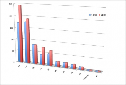
Notice the gap between coal-powered Alberta and Saskatchewan, and provinces with less GHG-intensive sources of electricity, such as Québec and Ontario. With more climate-friendly power, Ontario was able to accommodate the extra energy demand from growing populations and economies with just a small increase in electricity emissions, while Québec decreased its emissions from electricity from 1990 to 2008. Conversely, high rates of growth drawing on coal-fired power led to large pollution increases in Alberta and Saskatchewan.
Another factor affects the unequal geography of emissions increases: various provinces pursue various kinds of industrial development. As the Environment Canada analysis highlights, the oil and gas sector is responsible for nearly 40 per cent of total national emissions growth since 1990 - an astounding figure. This growth has been concentrated in Alberta, Saskatchewan and B.C. And if the sector keeps expanding at a breakneck pace, particularly in the oilsands, that high rate of emissions growth is likely to continue. (In the report cited here, Environment Canada states that, with production expected to double by 2015 relative to 2008, planned expansion in the oilsands "will put a strong upward pressure on emissions.")
Figure 2: Comparison of absolute GHG emissions (in megatonnes) by province in 1990 and 2008.*

We can draw some lessons from Canada's history of rising emissions to ensure that it isn't repeated.
First, the data makes a very strong case for greening our electricity grid. Reducing the heavy footprint of coal must be a priority, especially in Alberta and Saskatchewan.
Second, with such large growth forecast in oil and gas production, putting a strong regulatory framework in place is essential to ensure that industrial emissions drop in absolute terms. Without a robust and rising carbon price, we risk locking in another twenty years of abysmal emissions performance - right when Canada's main trading partners are moving to clean up their own economies.
So, here's to drawing a new map of emissions in Canada: one that pairs positive economic growth with a clear minus sign in front of our GHG emissions trend.
* All data from Environment Canada's National Inventory Report, 2010.


